ModCloth is a fashion retailer that focuses on female empowerment and inclusivity.
I led design projects from start to finish and implemented a research program where I mentored other designers in research and testing. I collaborated closely with PM, engineers and customer care, and was able to change our internal processes in order to highly improve the user experience for our customers.
The experience of returning & exchanging clothes at ModCloth was not up to standards. You had to go though several steps online and print your own return label. It was time to change that and provide the return label with the shipment. I identified several other issues with our process as well. We didn’t hold inventory for our customers and led them to believe they would receive items no longer in stock. We also operated with rules that were business focused instead of user focused. I made sure we changed that, even when it meant changing internal processes.
Size and fit research plan & personas
Size and fit in reviews
Category Page optimization
Product Detail Page optimization
Implementing research
Intranet for ModCloth
ModCloth received a lot of feedback from our customers about the experience of returning clothes. They expected to find a return slip in their package, but had to go though an online process and obtain a printer to be bale to return something. Internally Customer Care was spending too much time on interactions regarding returns.
.png)
Our goal for this project was to reduce Customer Care interactions about returns, and to create a better return experience for our customers. I worked closely with our Customer Care team, engineering team, and Chris McKnight who was the PM.
In addition to not providing a return slip in the package we sent out to our customer, customers had to go though a return process online before physically returning an item. We provided nothing in their package about this, so they were left to figure that out by themselves. With this project we created a much better experience by adding a return slip in their package. Most of the time there’s no need to go online, but there are situations where the user would want to look up an order or a return, or go online to print out a new return label.
If you have an account, you are most likely logged in to ModCloth. If you are logged in and click on a link to see your order, you will be taken directly to your order under your account. If you are not logged in and click a link to see your order, you will see the page below. There’s a chance you were logged out of your account, but most likely you did a guest check-out and don’t have an account if you see this page. To recap, looking up an order is the user’s goal when visiting this page.
OLD DESIGN
NEW DESIGN
The focus is on looking up order as that is the user’s goal. “Sign in” is secondary, but it’s there to support users who have an account but are logged out. “Sign up” is not a part of this page, as it’s not valuable here.

When a user is logged in and looks at their order history, they're most likely to have one of these 4 goals:
OLD DESIGN
NEW DESIGN
Shipping status is on top, as that is the most common goal on this page. To help the user recognize an order, there are pictures of up to 4 items from the order. Users tend to remember what they bought at the same time, so showing all items here is not necessary. “Exchange” is brought out in its own CTA. There’s no longer an online process that needs to be done to return items. A return label is shipped with the order, but in case the user looses it or needs more than one, they can always print a new return label here. Each order is also visually more defined as an entity.

.png)
“ I usually remember the order groupings, so seeing the four pictures is enough to reccognice my order. The visuals are very helpful. [...] I think this is super valuable because there’s so many things, style or look wise, that I want to look back at and maybe buy in another color version“

The users' goals for this page are the same as for the Order History page:
NEW DESIGN
I made it easier to scan information. The items are now above payment information since that’s how you can recognize the order and it is information that’s used more often than payment info. There’s pictures of the items for recognition. It’s possible to track the shipment or a return. It’s tied to the order status on top of the page, so if you have returned an item your status will be “Item returned” and the link will read “Track return”. Buttons to return or exchange items are placed both on top and on the bottom of the page, as these are main actions on this page.

.png)
The two largest issues I found in my expert walkthough of the exsisting exchange experience was:
In addition to the isses listed above, it was hard to see from the website that it was even possible to do an exchange, which lead to lost business as people returned items they might have exchanged for a different size or color. We would also say things like “ModCloth needs to receive the return within #30 days after ModCloth’s shipping date” in stead of “Return #30 days after you receive the package”.
I had several rounds internally to convince the right people that we needed to restructure to provide a better user experience. I’m proud to say that ModCloth now only lets users exchange into items that are actually in stock, and that they hold inventory so the user will get the products they exchange into. They have also changed the return policy to make it possible to provide deadlines that are user centered instead of company centered.
After clicking “Exchange” on an order you get to the page below. Here you pick which of the items in the order you want to return, and why. Why helps us understand how to improve the clothes or their description.

My goal here was to make it very clear what you return and what you exchange it into. The action here is to pick items to change into, so there’s CTAs to do that for each item.

The old module only had 1 image of the product you could exchange into. Mobile view didn’t show a picture at all. That’s a problem when users pick items mainly based on the image.
I improved the module by showing more images, improving the layout, remove the item#, and removing the warning since it’s no longer applicable when we hold inventory for our customers. On mobile I made it a full view instead of a module.


When new items have been chosen they show up to the right of the item that is returned. I have highlighted the part of the product that has changed, as it can look pretty similar to the original item.

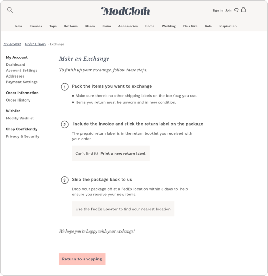
After completing the online exchange, the user will get the page below outlining the next steps and what to expect. In case the user needs a new return label, there’s a link to printing it out. Ho help the user find the nearest FedEx location, there’s a link to the FedEx Locator. In step 3 we now ask the user to ship the package within 3 days. We used to tell the user that ModCloth had to receive the package within a number of days after we shipped it to the user. I was able to change that to make it more user centric.